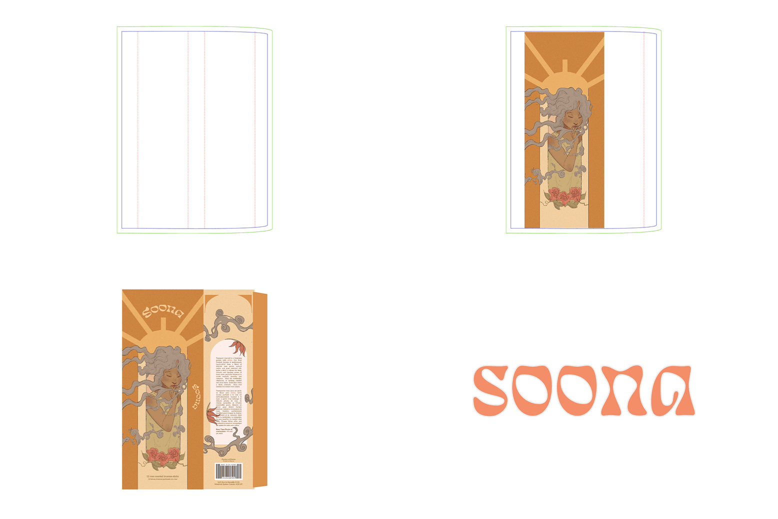
Final Die-Line
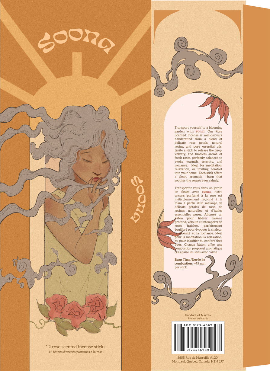
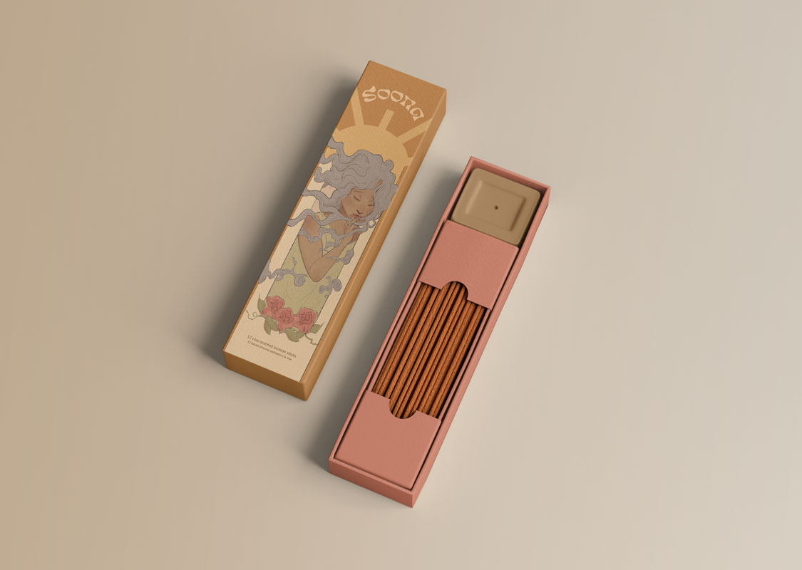
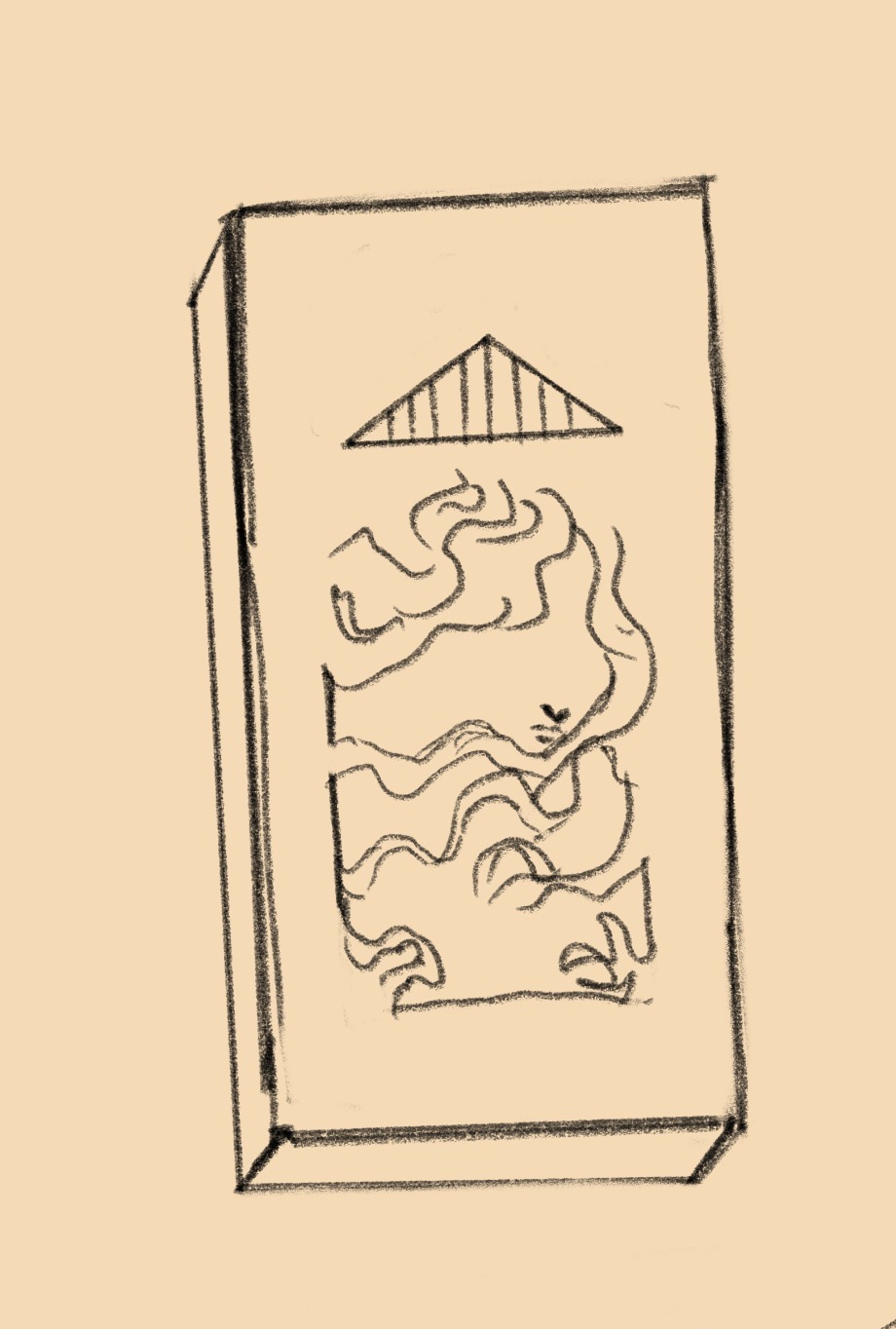
This is the final result of the incense packaging
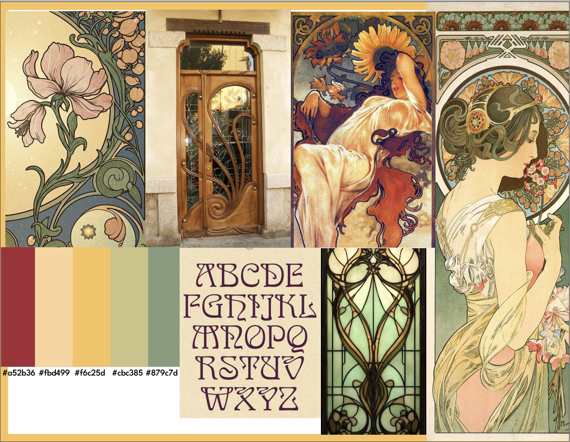
project. Picking the colors proved to be the most difficult choice for us to make as Art Nouveau uses a variety of beautiful colours. Not only that, but we had to make sure the colors were coherent and pleasing to look at.
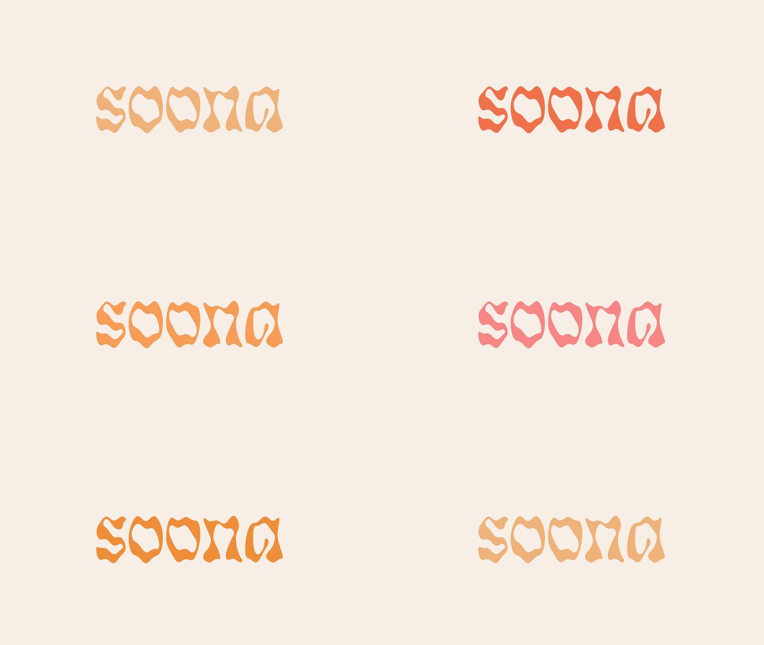
The typeface, Eckmannpsych was chosen because of the characteristics match Art nouveau and it resembles smoke, reminding us of incense.